Post by lee on Jul 30th, 2023 at 1:45pm

Note the scaling of the x axis.
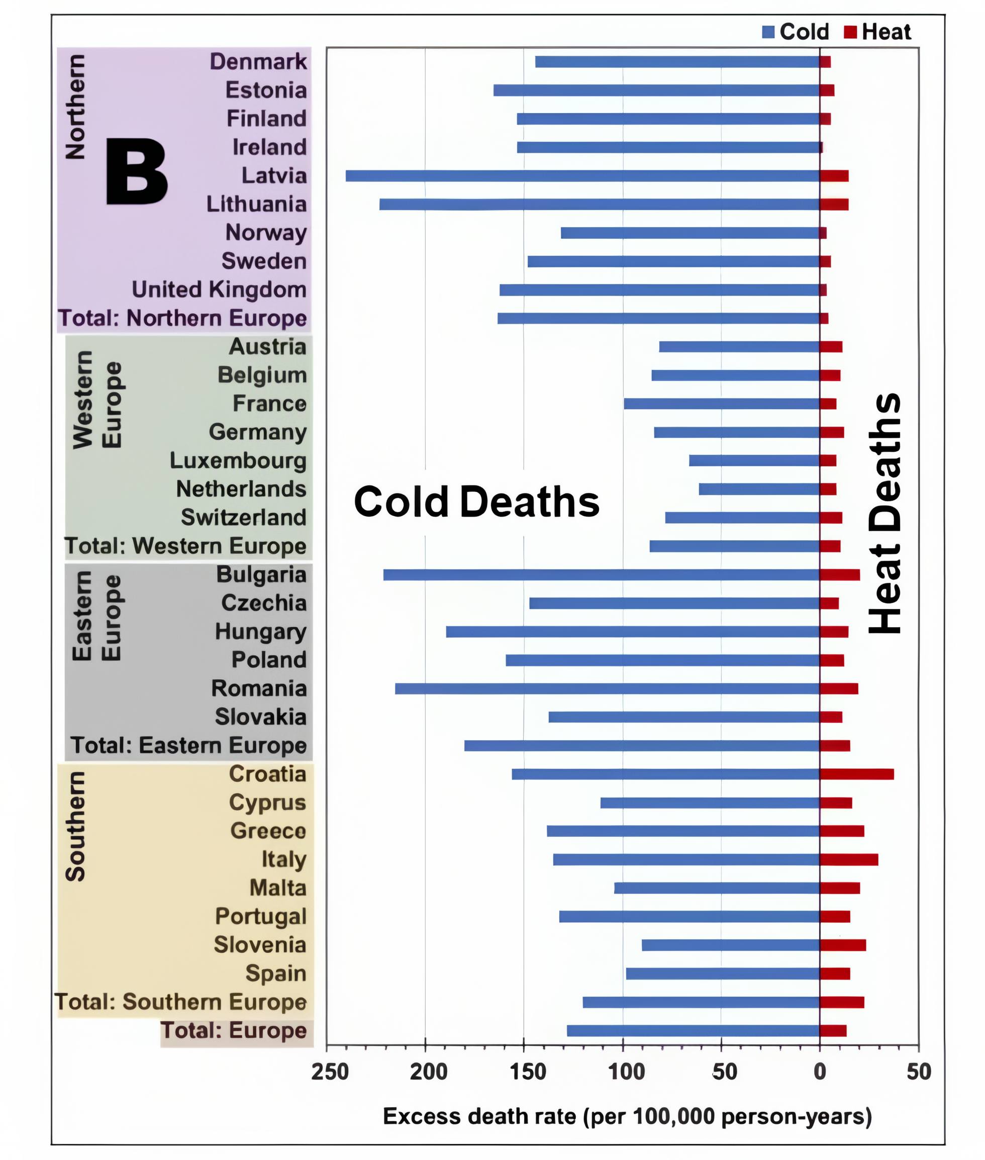
Image rescaled.
The Lancet a once respected institution. ::)
| Australian Politics Forum | |
|
http://www.ozpolitic.com/forum/YaBB.pl
Member Run Boards >> Environment >> How to lie with graphs http://www.ozpolitic.com/forum/YaBB.pl?num=1690688734 Message started by lee on Jul 30th, 2023 at 1:45pm |
|
|
Title: How to lie with graphs Post by lee on Jul 30th, 2023 at 1:45pm Note the scaling of the x axis. Image rescaled. The Lancet a once respected institution. ::) |
|
Title: Re: How to lie with graphs Post by AusGeoff on Jul 31st, 2023 at 2:19am
From the Lancet: https://www.thelancet.com/journals/lanplh/article/PIIS2542-5196(23)00023-2/fulltext?dgcid=raven_jbs_aip_email
I see nothing amiss with the first graph. The x-axis is simply compressed on the left of the zero point in order to encompass the far greater number of cold deaths. The death numbers are identical on both graphs. There is no "lie" with the Lancet's figure. |
|
Title: Re: How to lie with graphs Post by Frank on Jul 31st, 2023 at 11:57am
Similarly, the US Environmental Protection Agency on its website shows charts indicating the frequency, duration and intensity of heatwaves in the US have been increasingly steadily since the 1960s (heatwave index by decade) . ... But dig a little deeper on the website and one finds a “Heat Wave Index” going back to 1895, which clearly shows the heatwaves were more common before the 1960s, especially in the 1930s, before human-induced climate change was even considered.
https://www.epa.gov/climate-indicators/climate-change-indicators-heat-waves |
|
Title: Re: How to lie with graphs Post by Frank on Jul 31st, 2023 at 12:01pm AusGeoff wrote on Jul 31st, 2023 at 2:19am:
Except it gives a false visual impression of heat deaths being proportionally similar to cold deaths, which is the propaganda lie of the manipulated x axis. IF you use the same scale as the second graph, you can see that cold kills far, far more people than heat. |
|
Title: Re: How to lie with graphs Post by Frank on Jul 31st, 2023 at 1:07pm
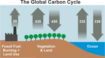
Here's another visual misrepresentation
Fossil fuels etc = 29 But the arrow representing it is barely narrower than the other, natural CO2 sources. |
|
Title: Re: How to lie with graphs Post by AusGeoff on Aug 1st, 2023 at 1:15am Frank wrote on Jul 31st, 2023 at 12:01pm:
The x-axis is not a scale—it's not meant to be. The numbers on the x-axis tell the story, and tell exactly the same story as the second graph. These infographics—and the global carbon cycle example—are meant to simply and quickly convey information. The width of the arrows on the carbon cycle infographic is merely representative; one must read the numbers—IE: the critical information. |
|
Title: Re: How to lie with graphs Post by lee on Aug 1st, 2023 at 11:53am
Yeah. About that Carbon cycle, did you notice there is no uncertainty whatsoever? Is that called lying by omission?
|
|
Australian Politics Forum » Powered by YaBB 2.5.2! YaBB Forum Software © 2000-2026. All Rights Reserved. |