Australian Politics Forum
http://www.ozpolitic.com/forum/YaBB.pl
Member Run Boards >> Environment >> Mapping the World for Climate Sensitivity
http://www.ozpolitic.com/forum/YaBB.pl?num=1455858275

Message started by lee on Feb 19th, 2016 at 3:04pm

Title: Mapping the World for Climate Sensitivity
Post by lee on Feb 19th, 2016 at 3:04pm
'By using information gathered by satellites, a group of biologists have developed a new method for measuring ecosystem sensitivity to climate variability.


By developing this method, the international team of researchers has been able to map which areas are most sensitive to climate variability across the world.

“Based on the satellite data gathered, we can identify areas that, over the past 14 years, have shown high sensitivity to climate variability,” says researcher Alistair Seddon at the Department of Biology at the University of Bergen (UiB).

http://www.uib.no/en/news/95898/mapping-world-climate-sensitivity


Global map of the Vegetation Sensitivity Index (VSI), a new indicator of vegetation sensitivity to climate variability using satellite data. Red colour shows higher ecosystem sensitivity, whereas green indicates lower ecosystem sensitivity. Grey areas are barren land or ice covered. Inland water bodies are mapped in blue.

So satellites are no good for temperature, except SST, but can measure climate sensitivity?
Good to see the majority of Australia is not sensitive,
Title: Re: Mapping the World for Climate Sensitivity
Post by John_Taverner on Feb 25th, 2016 at 5:34pm
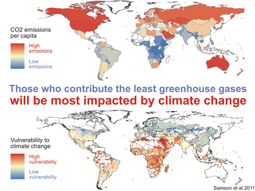
That's a similar result to a number of  papers published about 6 years ago. For example Samson et al 2011.

(Don't confuse climate sensitivity and ecosystem sensitivity. They are totally different)


China's emissions have increased a bit since then though.

Title: Re: Mapping the World for Climate Sensitivity
Post by lee on Feb 25th, 2016 at 5:53pm
Ahh yes, the old per capita argument. Large country, small population, emissions for moving goods. Don't you just love the Alice - all those people, manufacturing, emitting CO2.

And Australia is a carbon sink. Maybe they should pay us.

Title: Re: Mapping the World for Climate Sensitivity
Post by malcolmISthetumbleweed on Feb 25th, 2016 at 6:38pm

John_Taverner wrote on Feb 25th, 2016 at 5:34pm:
That's a similar result to a number of  papers published about 6 years ago. For example Samson et al 2011.

(Don't confuse climate sensitivity and ecosystem sensitivity. They are totally different)


China's emissions have increased a bit since then though.

Why does the bottom graphic show Australia largely in white and what does that mean?

Title: Re: Mapping the World for Climate Sensitivity
Post by malcolmISthetumbleweed on Feb 25th, 2016 at 6:40pm

lee wrote on Feb 25th, 2016 at 5:53pm:
Ahh yes, the old per capita argument. Large country, small population, emissions for moving goods. Don't you just love the Alice - all those people, manufacturing, emitting CO2.

And Australia is a carbon sink. Maybe they should pay us.

Sometimes you like the per capita argument  ::)

Title: Re: Mapping the World for Climate Sensitivity
Post by John_Taverner on Feb 25th, 2016 at 7:23pm

BatteriesNotIncluded wrote on Feb 25th, 2016 at 6:38pm:

John_Taverner wrote on Feb 25th, 2016 at 5:34pm:
That's a similar result to a number of  papers published about 6 years ago. For example Samson et al 2011.

(Don't confuse climate sensitivity and ecosystem sensitivity. They are totally different)


China's emissions have increased a bit since then though.

Why does the bottom graphic show Australia largely in white and what does that mean?


Two reasons. 1. - Australia is projected to have less warming on a regional basis  2. Australia is relatively affluent and is therefore easier to adapt to any changes. (For example, well developed irrigation schemes.)

Title: Re: Mapping the World for Climate Sensitivity
Post by John_Taverner on Feb 25th, 2016 at 7:25pm

lee wrote on Feb 25th, 2016 at 5:53pm:
Ahh yes, the old per capita argument. Large country, small population, emissions for moving goods. Don't you just love the Alice - all those people, manufacturing, emitting CO2.

And Australia is a carbon sink. Maybe they should pay us.


I was actually alluding to the similarity of the second map to the paper in your OP.

Title: Re: Mapping the World for Climate Sensitivity
Post by The_Barnacle on Feb 25th, 2016 at 8:45pm

lee wrote on Feb 19th, 2016 at 3:04pm:
Global map of the Vegetation Sensitivity Index (VSI),

So satellites are no good for temperature, except SST, but can measure climate sensitivity?


John_Taverner wrote on Feb 25th, 2016 at 5:34pm:
(Don't confuse climate sensitivity and ecosystem sensitivity. They are totally different)


Yes I think that Lee has been caught out again not understanding his own cut and pastes


BatteriesNotIncluded wrote on Feb 25th, 2016 at 6:38pm:
Why does the bottom graphic show Australia largely in white and what does that mean?


My take on that is that 70% of Australia is arid or semi arid already so a warming climate won't have as much of an adverse effect on that.

It is the fertile south east that will experience the largest impact and that is also where most of the people live.

Title: Re: Mapping the World for Climate Sensitivity
Post by lee on Feb 25th, 2016 at 9:41pm

The_Barnacle wrote on Feb 25th, 2016 at 8:45pm:
Yes I think that Lee has been caught out again not understanding his own cut and pastes


;D ;D ;D ;D ;D


Title: Re: Mapping the World for Climate Sensitivity
Post by BatteriesNotIncluded on Feb 27th, 2016 at 5:37pm

The_Barnacle wrote on Feb 25th, 2016 at 8:45pm:

lee wrote on Feb 19th, 2016 at 3:04pm:
Global map of the Vegetation Sensitivity Index (VSI),

So satellites are no good for temperature, except SST, but can measure climate sensitivity?


John_Taverner wrote on Feb 25th, 2016 at 5:34pm:
(Don't confuse climate sensitivity and ecosystem sensitivity. They are totally different)


Yes I think that Lee has been caught out again not understanding his own cut and pastes


BatteriesNotIncluded wrote on Feb 25th, 2016 at 6:38pm:
Why does the bottom graphic show Australia largely in white and what does that mean?


My take on that is that 70% of Australia is arid or semi arid already so a warming climate won't have as much of an adverse effect on that.

It is the fertile south east that will experience the largest impact and that is also where most of the people live.

Yeh,I suppose I have to agree as that was the only part with any colour on it.

Living in WA I know that the south west is seeing 30 year patterns of decreasing rainfall but as it's all par for the course, meh!

Fascinating how because we are already so barren and dry that the statistic has caveats if you will.


Australian Politics Forum » Powered by YaBB 2.5.2!
YaBB Forum Software © 2000-2026. All Rights Reserved.